Cloud Profiles Redesign
USER EXPERIENCE · PRODUCT DESIGN
Background
The A Cloud Guru profiles were called 'Cloud Profiles'. My team was responsible for working on them as part of our initiative to build a jobs platform that would connect people learning cloud with jobs in cloud. The intention was that the matching of users with employers would be driven by their cloud profiles.
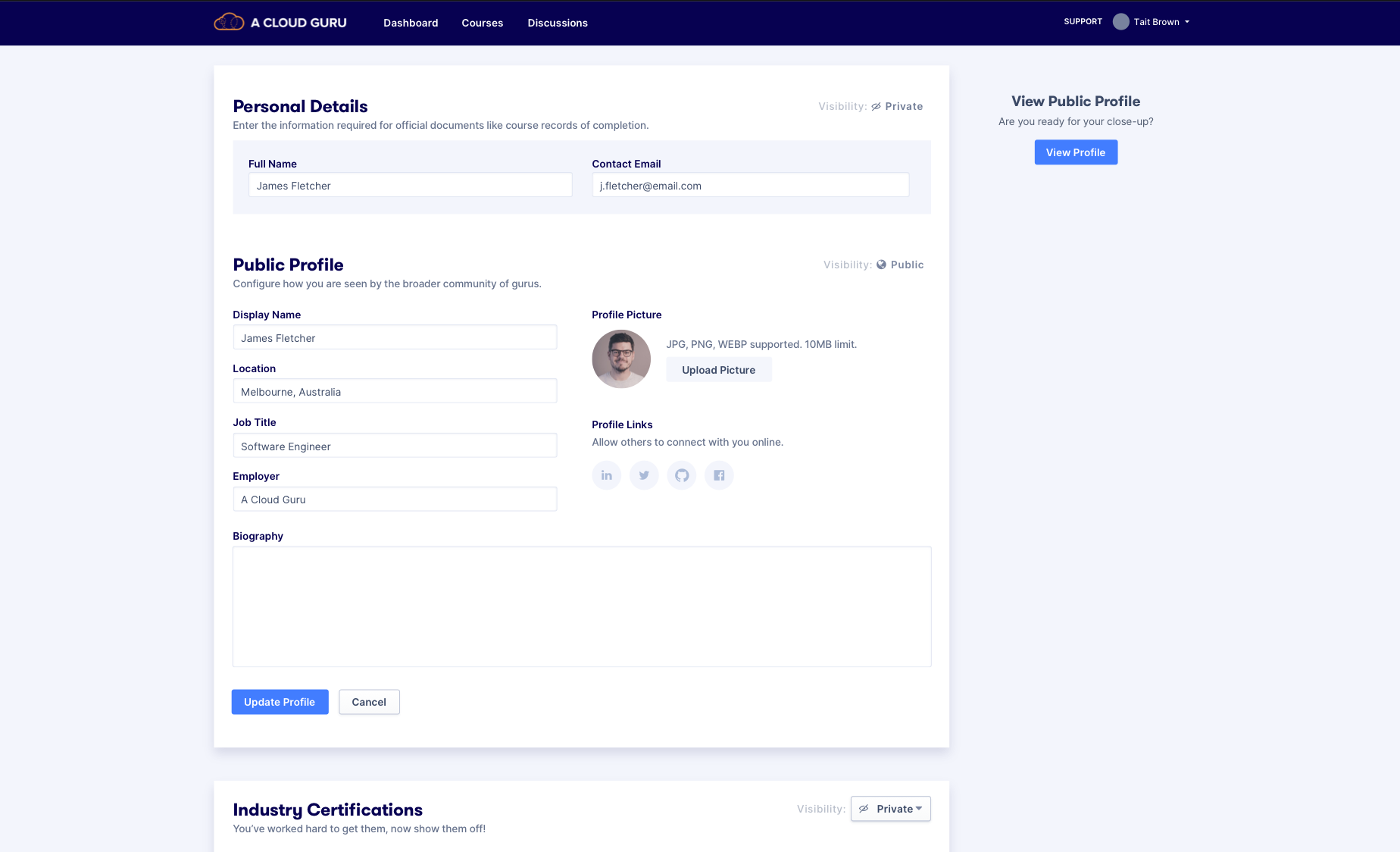
The original cloud profile
Identifying the problem(s)
- Privacy settings were misleading to users
To get users to add some types of information to their profile (such as employment history), we needed to allow them to make some parts of their profile private. This is so that the information wouldn't be publicly visible, but when they applied for a job on the platform they could use their profile. We needed to make the controls for configuring these settings clearer. - There was some legacy tech adding limitations on users
The profile also included a Certificate Uploader that took users to a different page where they could drag and drop a PDF file. It would then read the file and create the certificate in their profile. The problem with this was that it was hard to maintain as certificate names were changing all the time and there were limitations on the number of certificate types we could read.
We needed a more versatile solution as we wanted users to add as many certificates as they could so that their profiles would look better if they wanted to use it to apply for a job. - There were some usability issues with profile feature
The profile was made up of 2 different pages - View and Edit. If a user landed on their profile and wanted to change something you would be taken to essentially the same page but with editable fields. We felt like we were adding unnecessary clicks for the users.
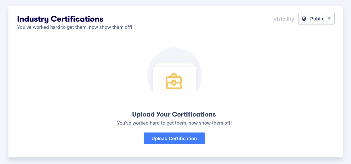
The certificate section of the Cloud Profile.
🧪 Research activities
We sought internal feedback from people in the company:
- We currently display privacy toggles, but they do not work
- Users expect information to be private unless otherwise configured
- Is the word ‘Privacy’ a red flag? (Can we say share or hide instead)
User tests and interview feedback
- We discovered that there were varying degrees of what people want private in their profiles. This means that our solution needs to be as customisable as possible for users.
- Language of some parts of the profile may impede completion
We had sections in the profile named 'Course transcripts' and 'Bio' - these were misleading to the users and either confused them or caused them to decided not to complete those sections.
I can't seem to edit any of my public/private profile settings, ie toggle it on or off. The switch action is greyed out. My overall thoughts so far oncoming back to this site is that the changes look like they require further developing...
- Excerpt from Hotjar
1️⃣ Privacy Settings
We drew references from other websites that our users would use. Based on these references, we came up with a few solutions for user testing.
How does...
...Stack Overflow do it?
Everyone has a ‘public profile’ |
...Github do it?
Everyone has a ‘public profile’ |
...Linkedin do it?
Live preview of what their profile looks like so that they can curate what they present |
Solution 1
-
Granular settings
Allowing users to feel that they are in control. You could make each section Private, Public or available for Hirers to view only. -
Public profile
Your public profile is a separate entity and you can pick and choose what it picks up from your profile
Solution 2
-
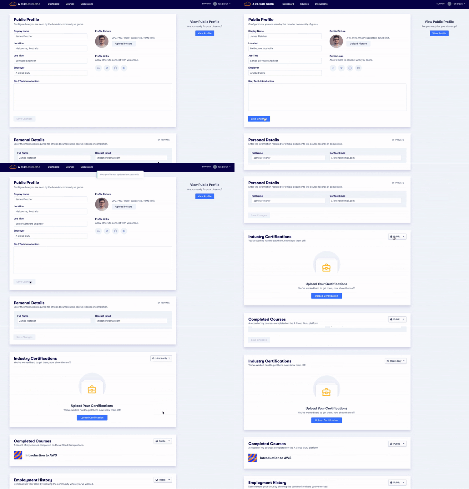
Using the dropdown as a means to educate users
Only have privacy toggles on auxiliary sections. These sections generally have no sensitive information without the user taking any action. The sections start of as ‘public’ which help users discover the hirer setting when they click on the drop-down - this could help discoverability of the Jobs Platform.
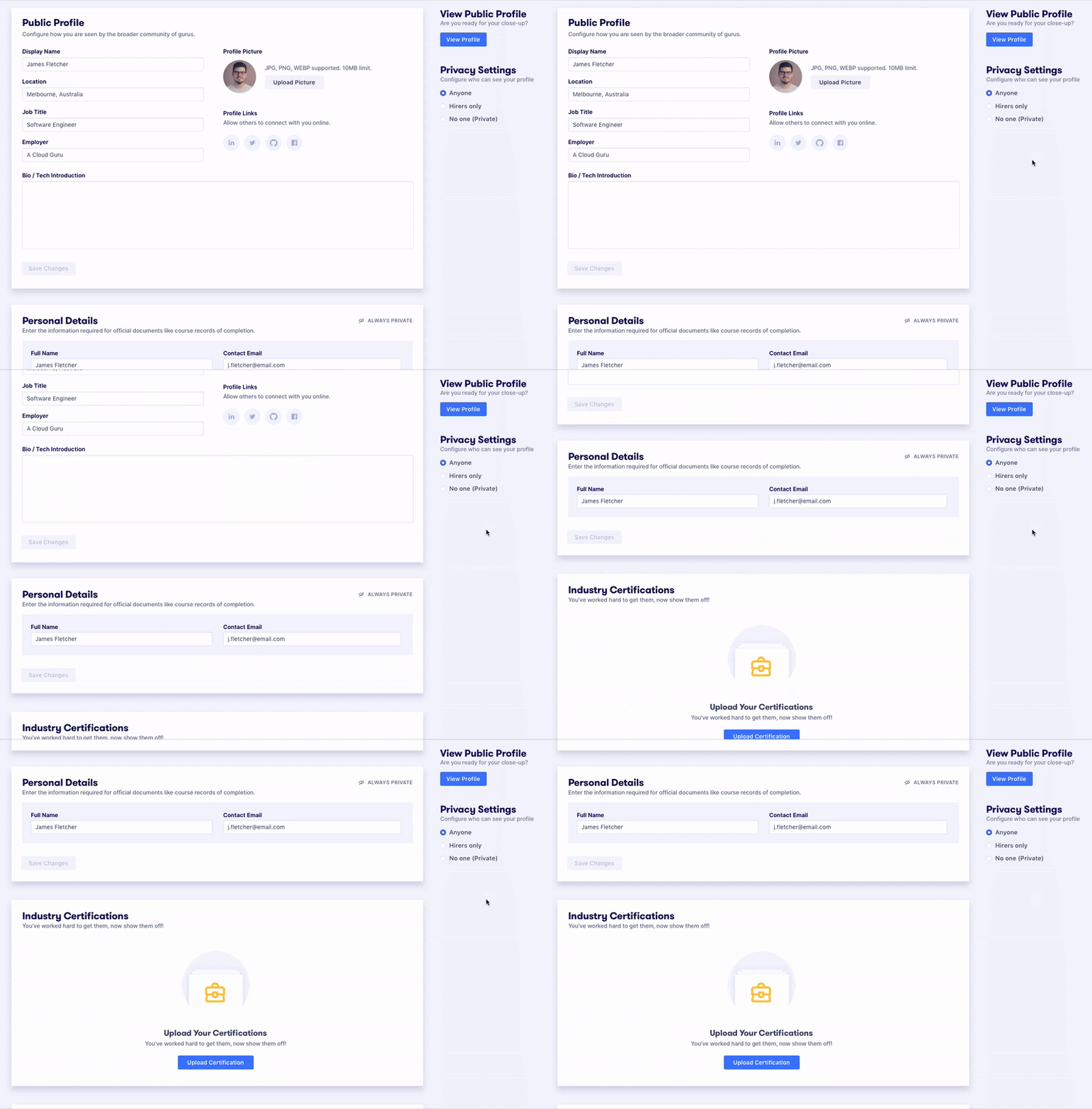
Solution 3
Implement a Global Privacy setting that makes it easy for the user to change their privacy settings and also makes the ‘hirer’ option prominent.
The downside to this solution would be that it made making your profile completely private too easy. As a result we may be limiting the pool of available to our potential hirers.
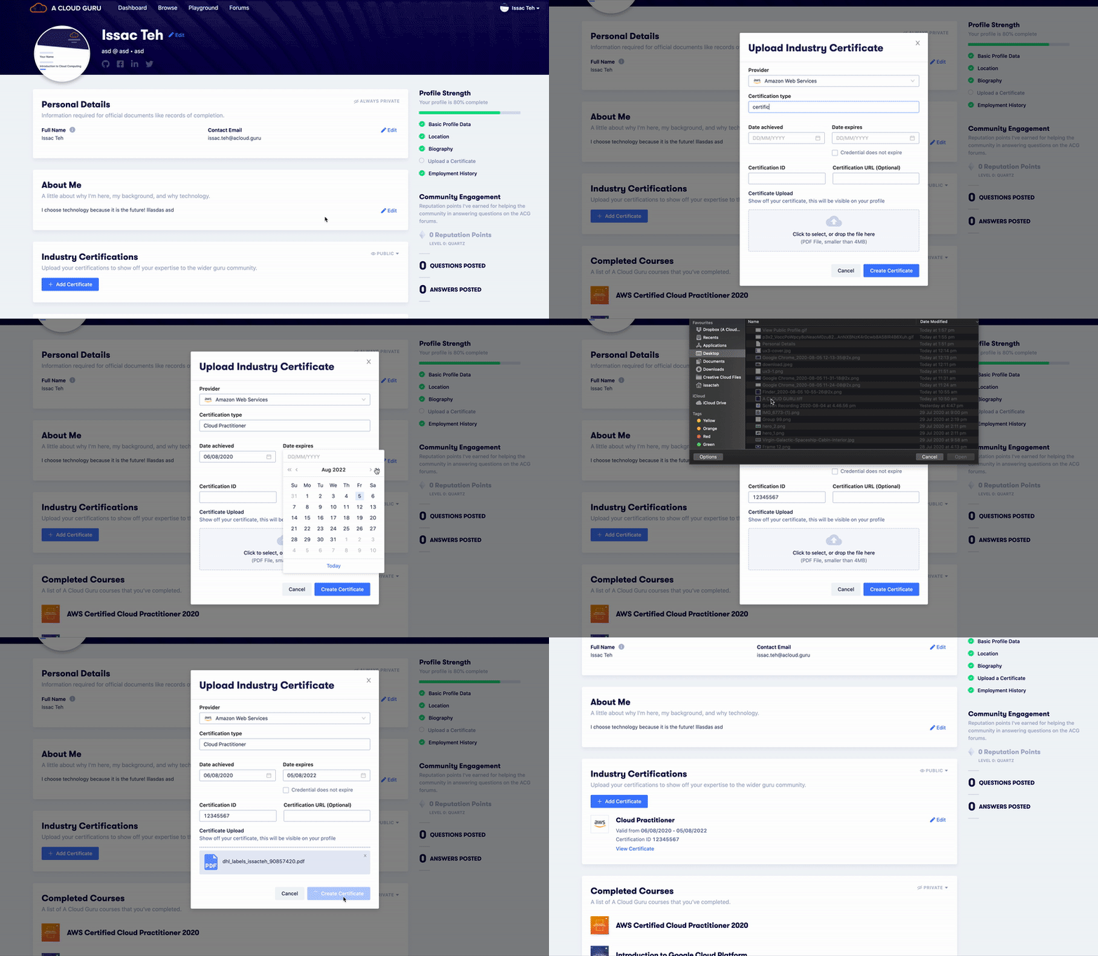
2️⃣ Certificate Uploader
- We created a solution where you created your certificate entry in a modal - meaning you didn't have to be taken through a whole upload wizard)
- We included the ability to add custom certificates, this meant that it would reduce the number of errors coming through. Previously if the uploader was unable to read the certificate it would result in an error.
- Created a shorter feedback loop for the user thus improving the general user experience.
3️⃣ Usability
Viewing and editing your profile were two separate pages, that was making it difficult for users to understand and navigate. You had to edit your profile, then click on view profile to see what it would look like to others.
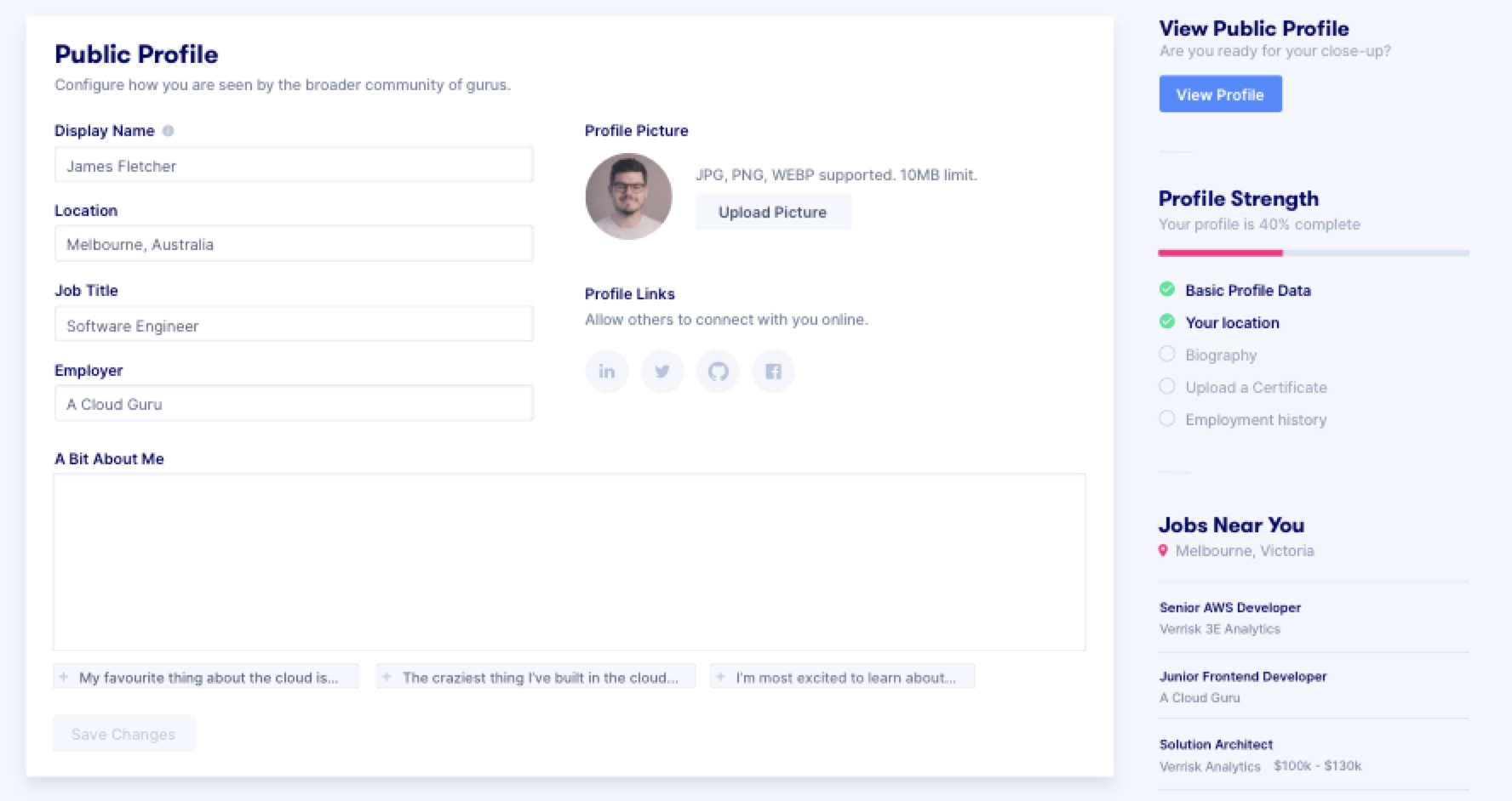
We wanted to create a profile page where users edited in-line. A pattern we noticed with other profile pages from other sites. This meant that there would be no context-changing for users between edit and view. In order to do this we needed to:
- Add the ability to edit
- Change the layout so that it would tell the users that 'this is what your profile will look like'

We started exploring layouts that made the profile page look more like a conventional profile page.
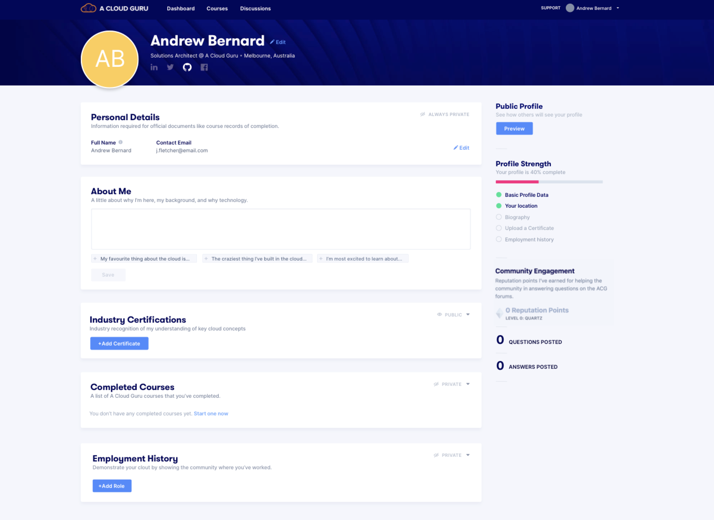
The result is the profile page below. The way that it worked was that if you were the logged in user, the interface would present you all of the edit options. If you were a different person viewing the profile it would simply drop all the edit functionality as well as sections that were marked as private.
Anything that we couldn't edit in-line would be covered using modals so that you're always in context while you're editing your profile.
Conclusion
While just a simple profile page, the combination of those three initiatives; improving privacy, certificate uploading and usability came together to create a cohesive and markedly better user experience for the users.
Our user research enabled us to understand their mental models of what certain interfaces should look like and what they desire from our product. That enabled us to create a final product that was beneficial to both them and the business.