Conversion Optimisation
USER EXPERIENCE · PRODUCT DESIGN
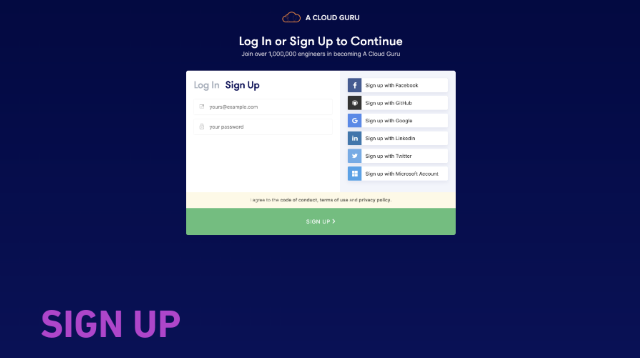
As part of an Activation and Onboarding initiative we explored the first time user journeys of people joining the platform. One of the areas that we found opportunity for improvement was the Log In and Sign Up page.
Problems
- Conversion - we were looking at a 62% drop-off
- Confusion with the UI layout and hierarchy.
- It was not clear to a user whether they were on the Log In or Sign Up tab
- With social sign on - users would sign-up using one method and forget what sign-up method they used.
- Tech issues - Application is in Angular and not react. Redirects. Limited tracking.
- Support tickets on Zendesk informed us that users found the password reset process difficult and also probably were not able to find the link easily.
Research Activities
- 10 people in-person (8 B2C, 2 B2B, 2 had never trialled)
- 5 variations on the activation and onboarding journey
- Looked at competitors and other Auth0 Log In and Sign Up pages
Research Activities
- 10 people in-person (8 B2C, 2 B2B, 2 had never trialled)
- 5 variations on the activation and onboarding journey
- Looked at competitors and other Auth0 Log In and Sign Up pages
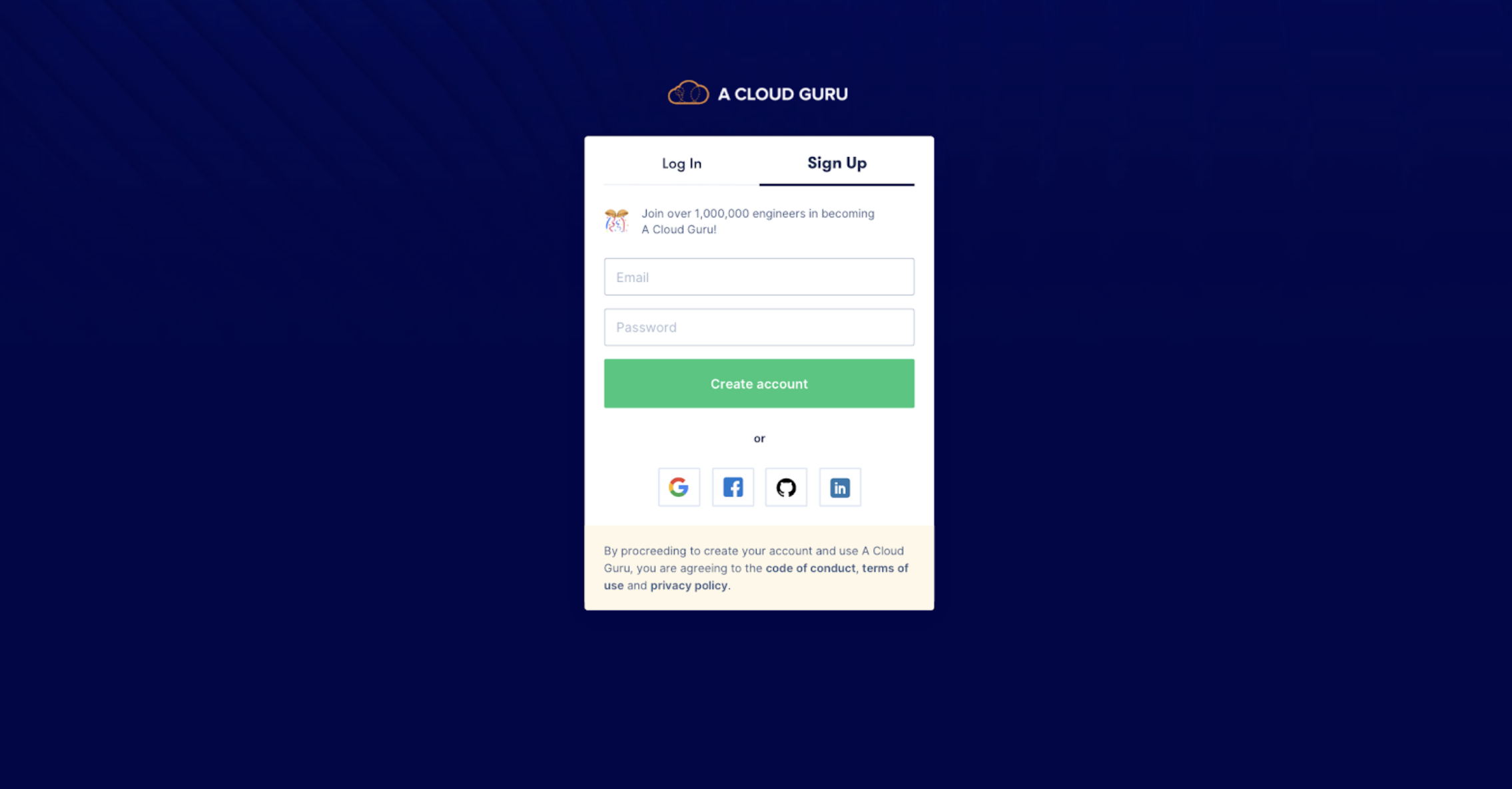
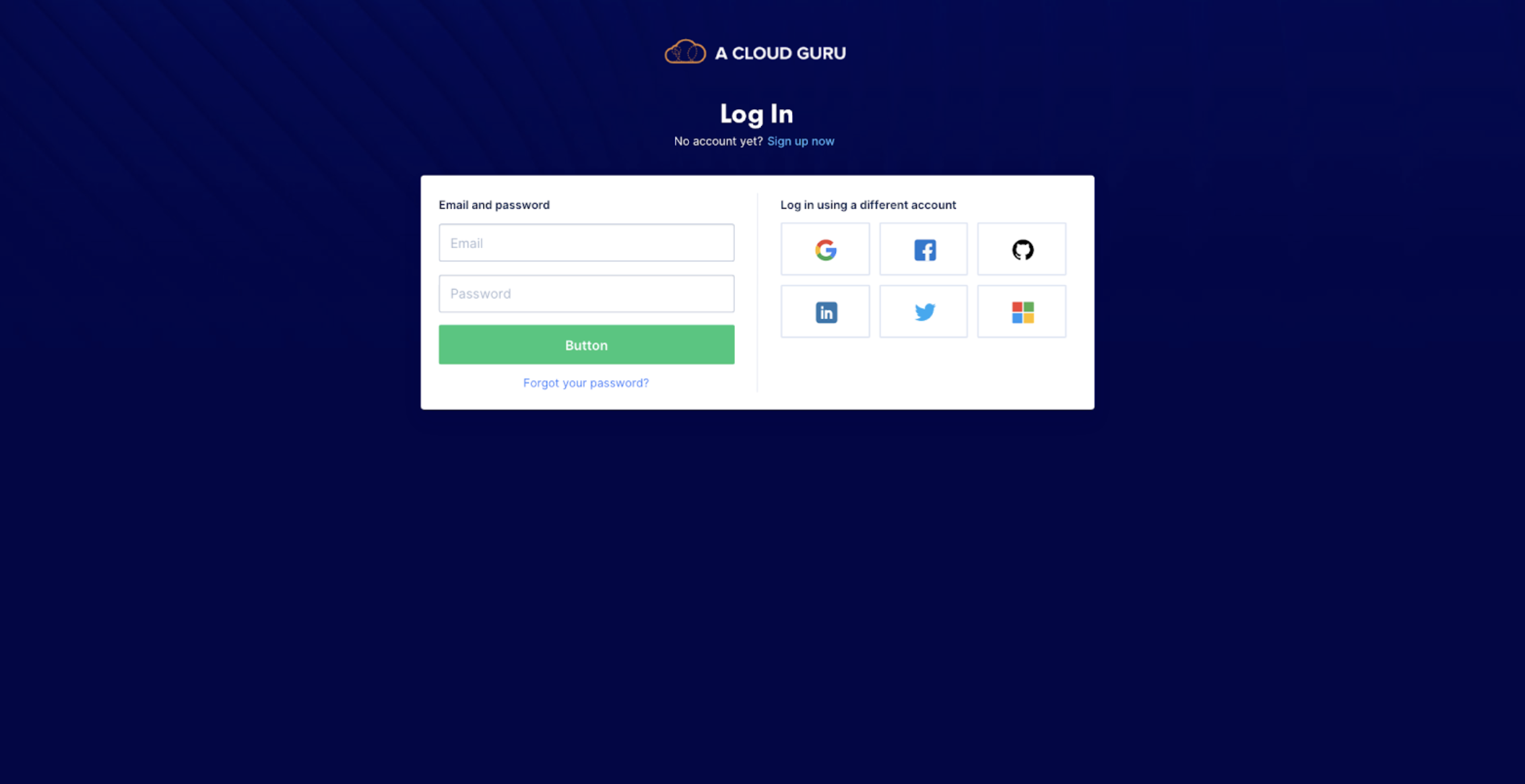
Iteration Round 1
We experimented with changing the scale of the social buttons so that users would be able to to understand that they were equal but different methods of logging on.
|
|
|
|
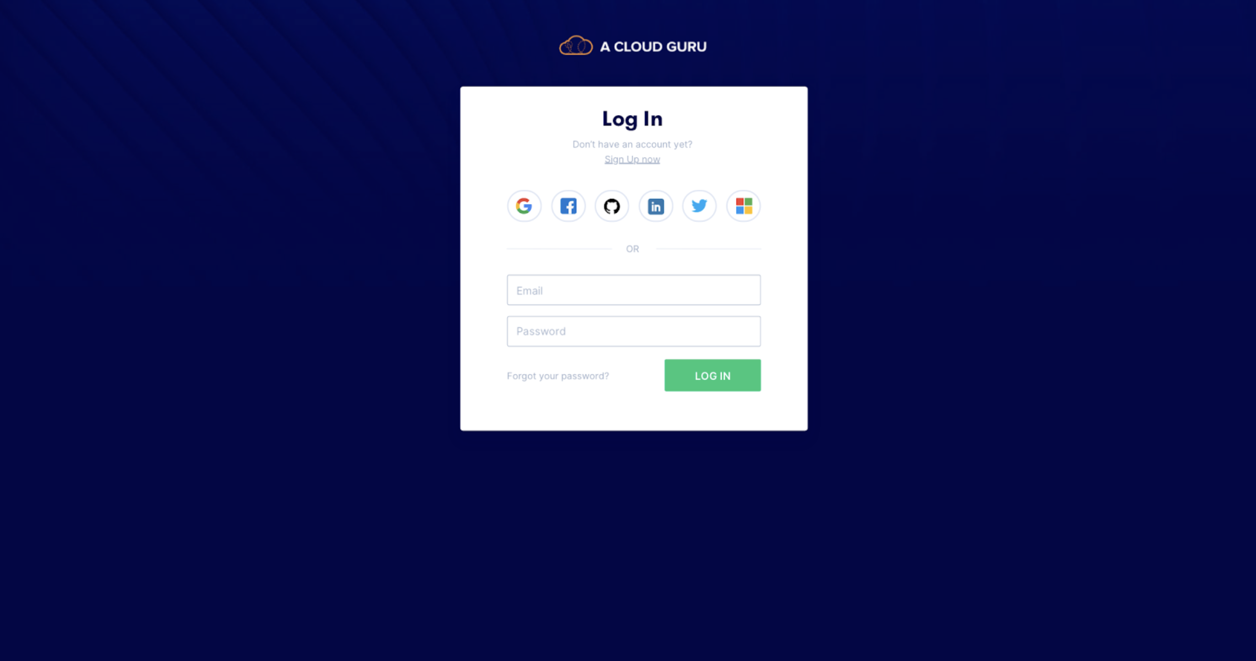
Iteration Round 2
|
|
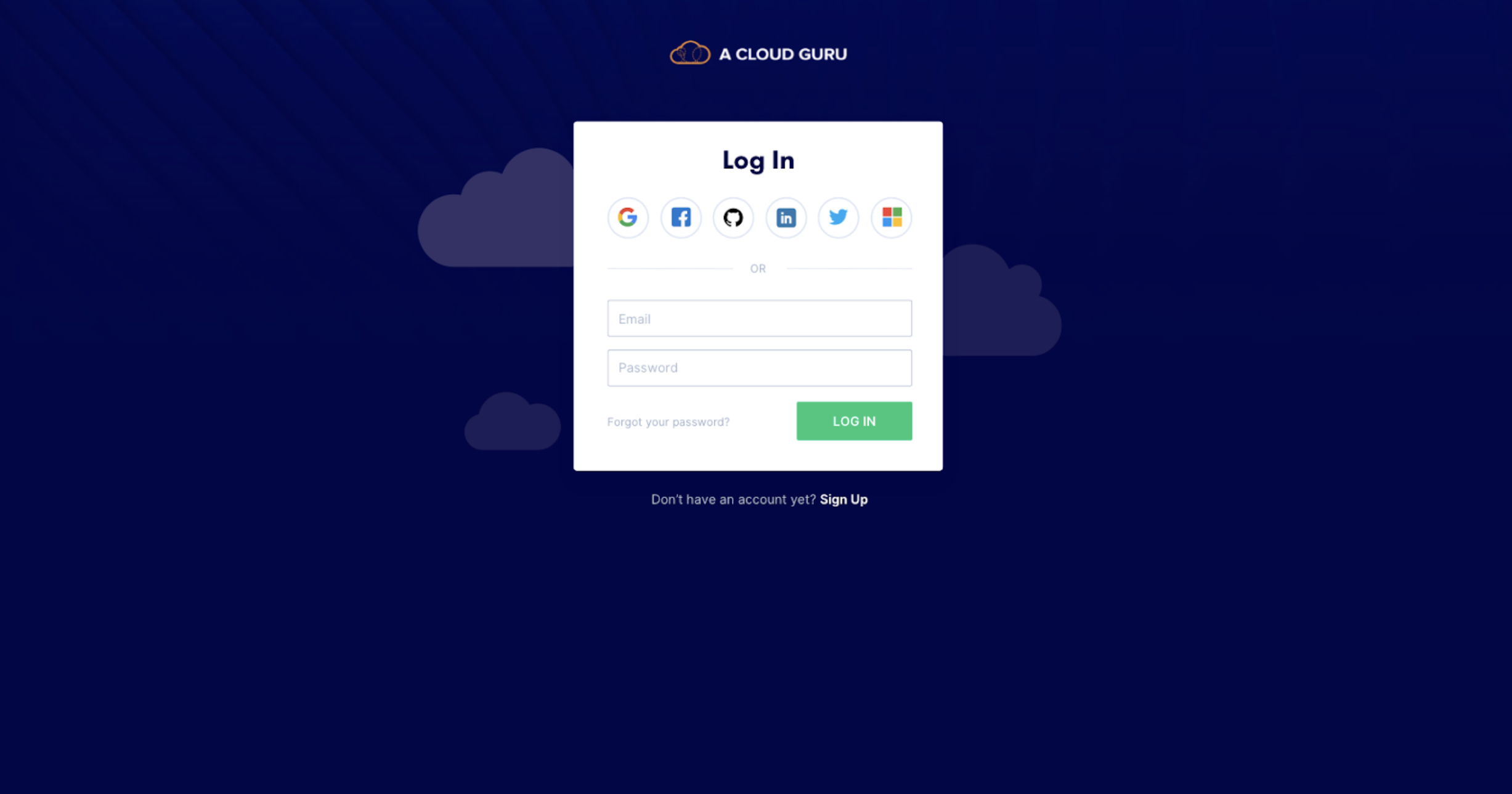
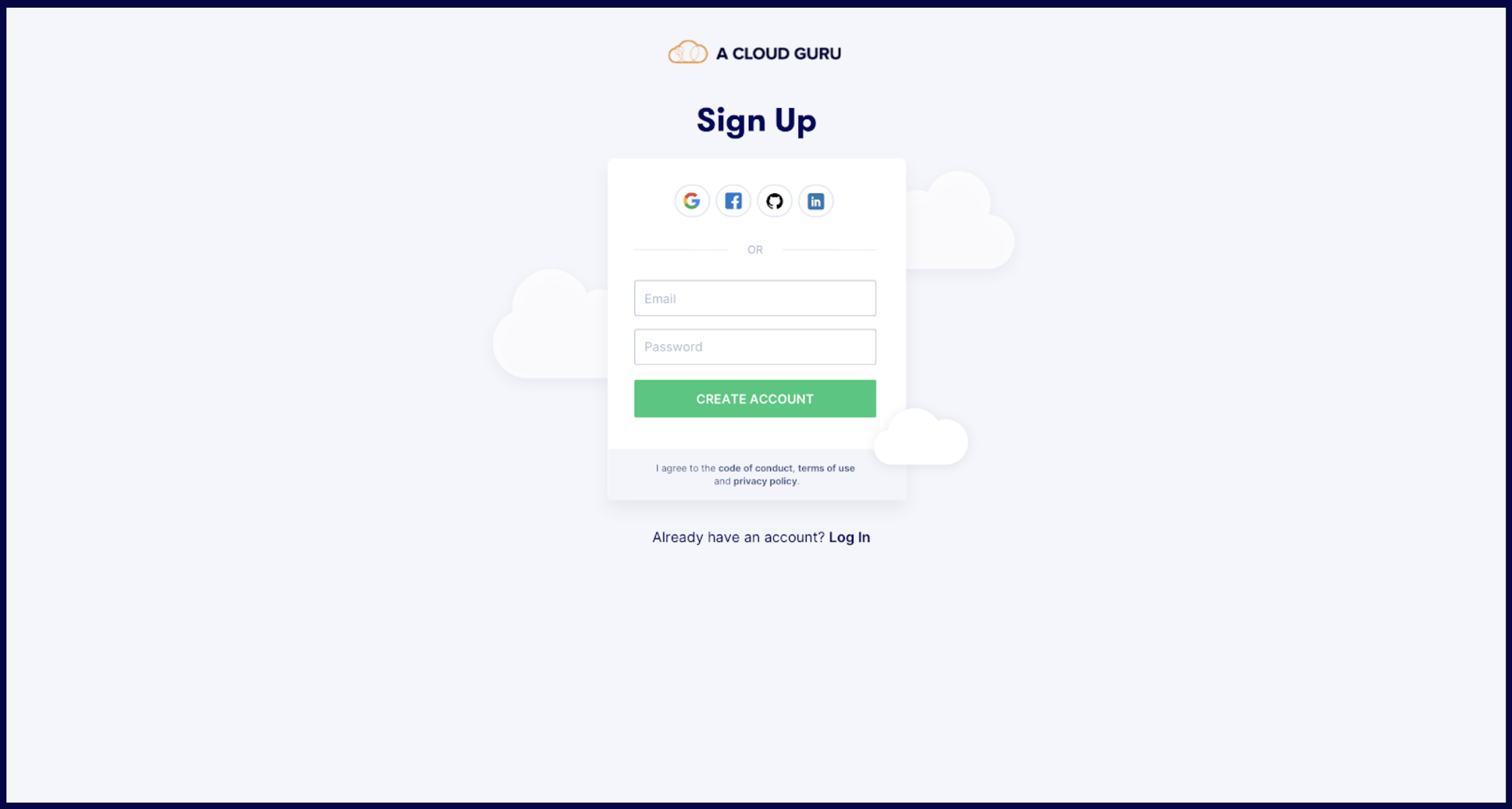
Exploring trying to add more ‘Fun’ elements into the layout and conceptually bring in the clouds:
|
|
Iteration Round 3
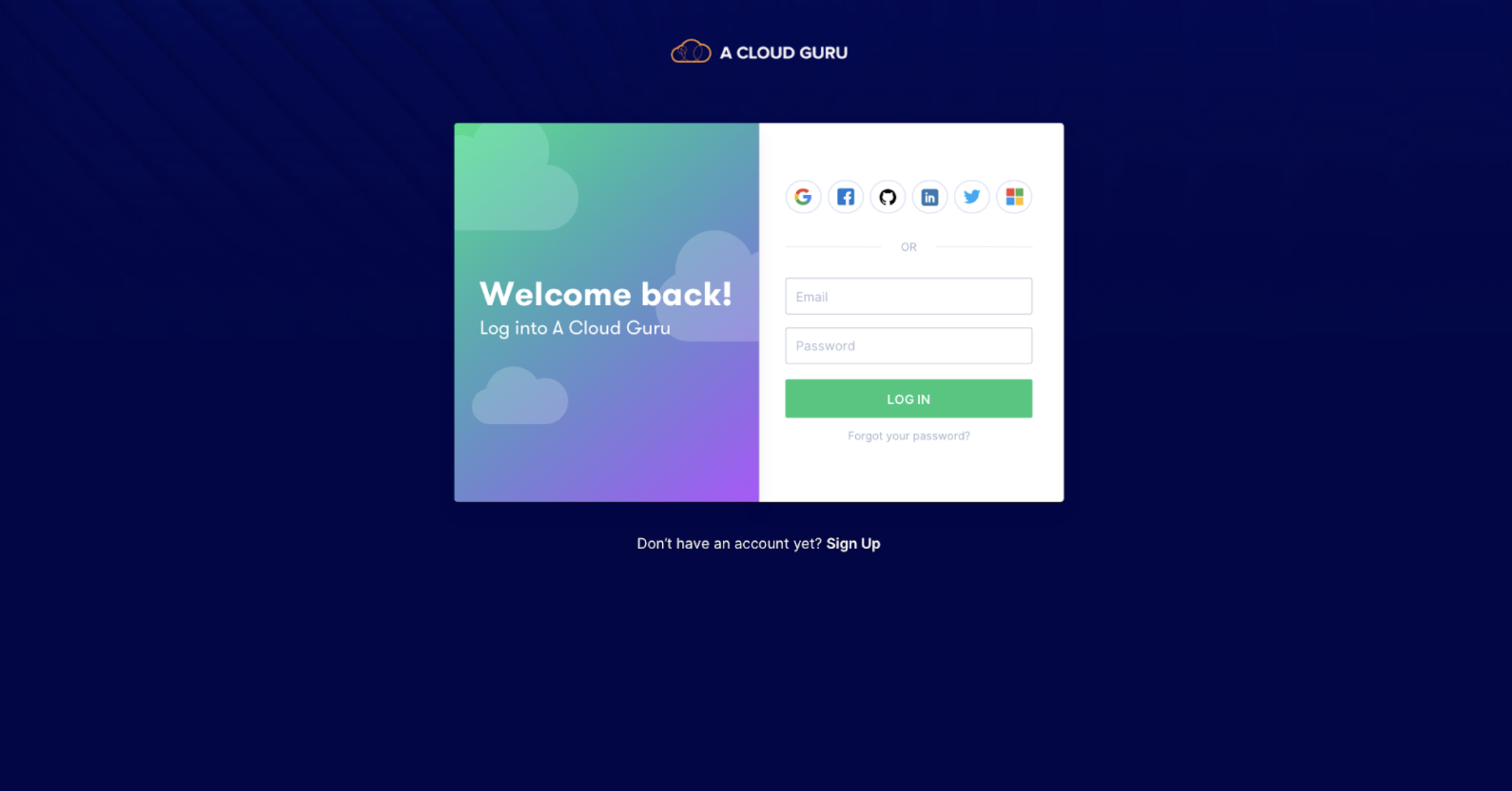
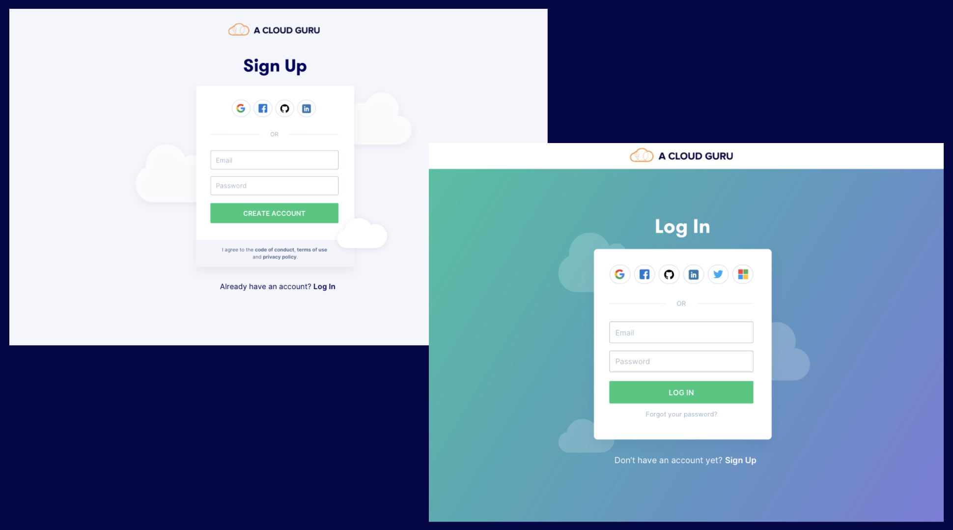
- Starting to fully explore alternate layouts, heavily influenced by research done on:
- What are others doing?
- What are login/signup best practices?
- Also exploring different ways of incorporating fun and colour.
- Crit feedback: Let’s experiment breaking it out of the container and making it less heavy with the blue.
Final Solution
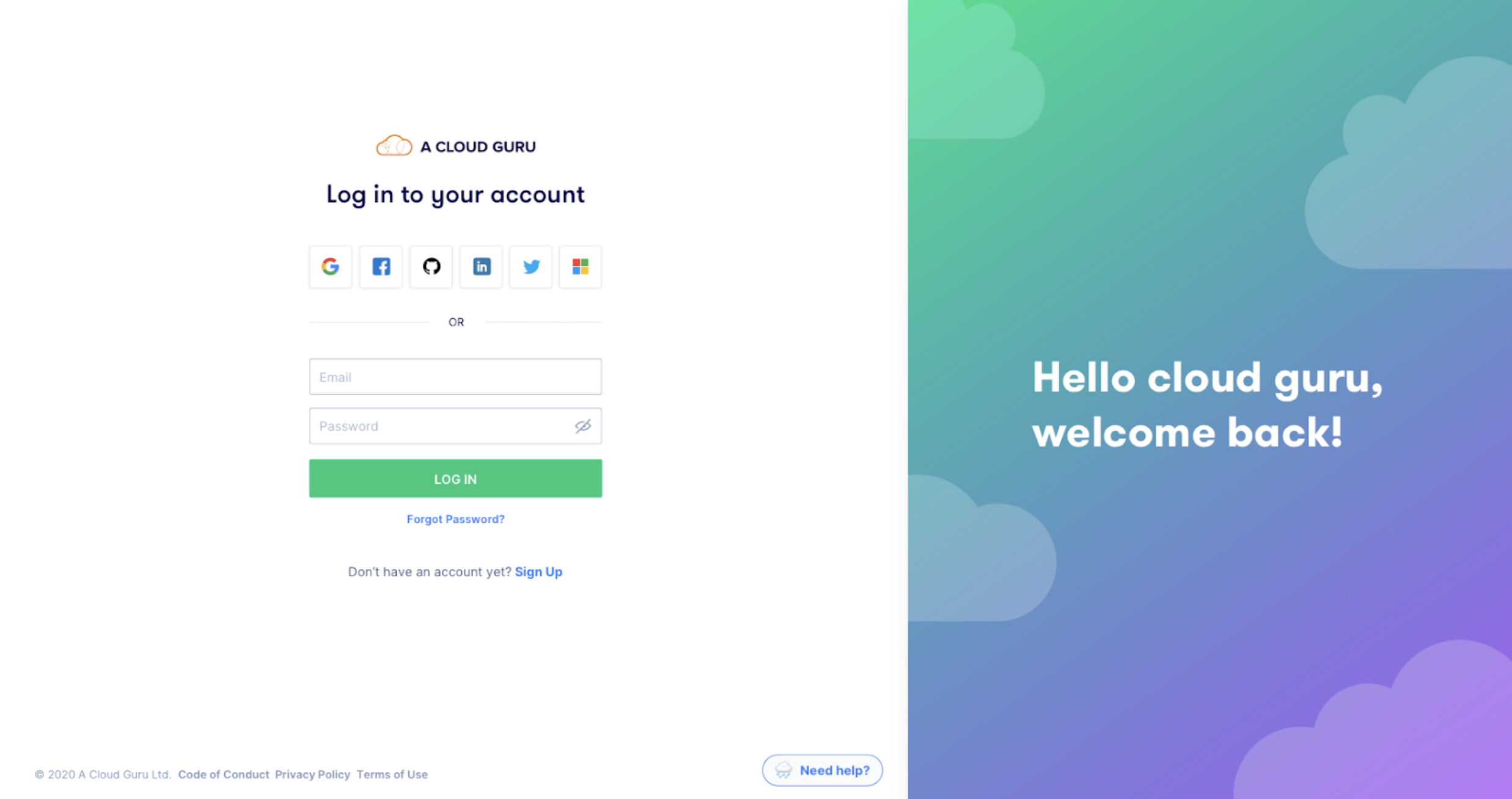
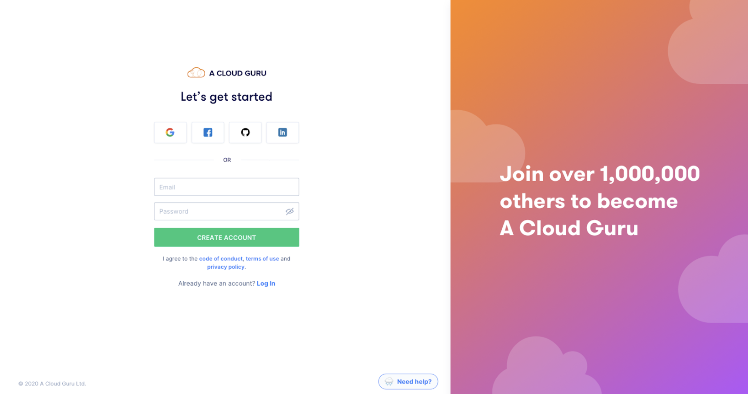
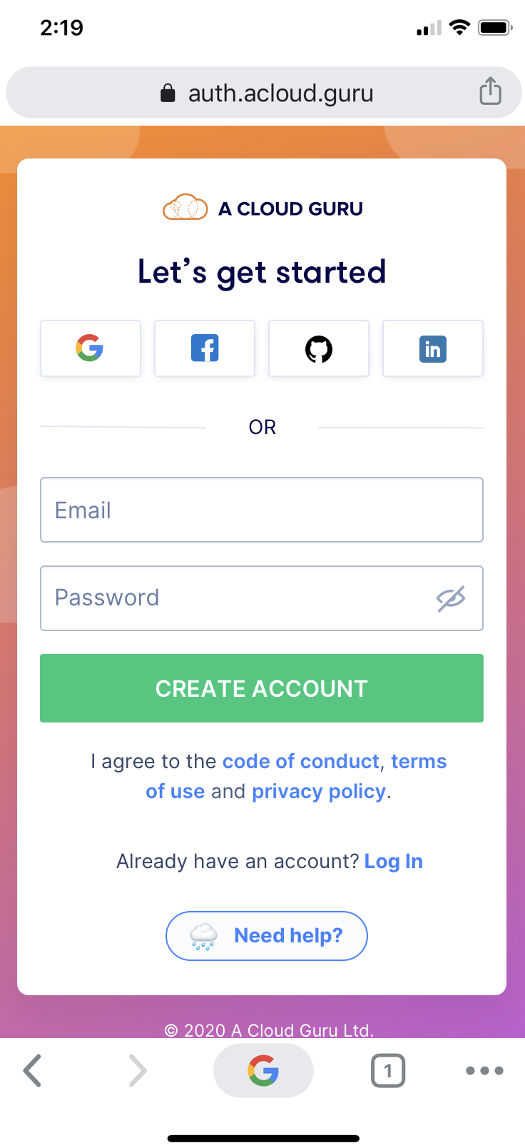
Our final solution was confirmed by multiple rounds of internal feedback and user testing. We wanted to remove any distractions and help users to focus on their Jobs to be Done. The solution included:
- A quick way for users to get help
- A footer to the page with privacy and copyright information
- Additional copy on the right (rather than the left so that it is not distracting)
- Mobile version
- I created a prototype to prove some scroll effects: https://naughty-volhard-dd2ac8.netlify.app/

|
|