Iterate Fast, Test Often
USER EXPERIENCE · PRODUCT DESIGN
Sidekicker is a casual and temporary staffing marketplace platform. Businesses would post jobs and pre-screened, skilled workers would apply, be selected, be paid, and rated via the platform.
The Problem
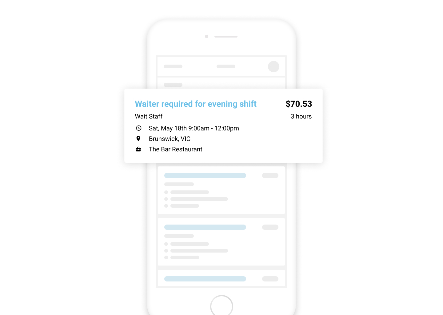
Workers viewed and applied for jobs via a mobile app. These jobs would be displayed as cards in a feed - a pattern that most users would be familiar with. The issue with this was that businesses that posted more jobs would get greater visibility than smaller businesses that might only have 1 job active and would get pushed further down in the feed.
We also acknowledged that this could be an overwhelming experience for workers and we were asking them to consume quite a lot of information at once. We wanted to make sure that the experience was not overwhelming.
Starting Point
We started collecting stakeholder feedback internally, this allowed us to identify the problems. Next, we began to ideate - What could we do to make this feed better?
Data
We now sought data to better understand what workers were looking for and to help validate the problem. I conducted a survey with 50 of them and asked some key questions:
- What is most important to you when looking for casual employment?
- What do you look for when browsing a job board?

Here's what we learnt from these activies:
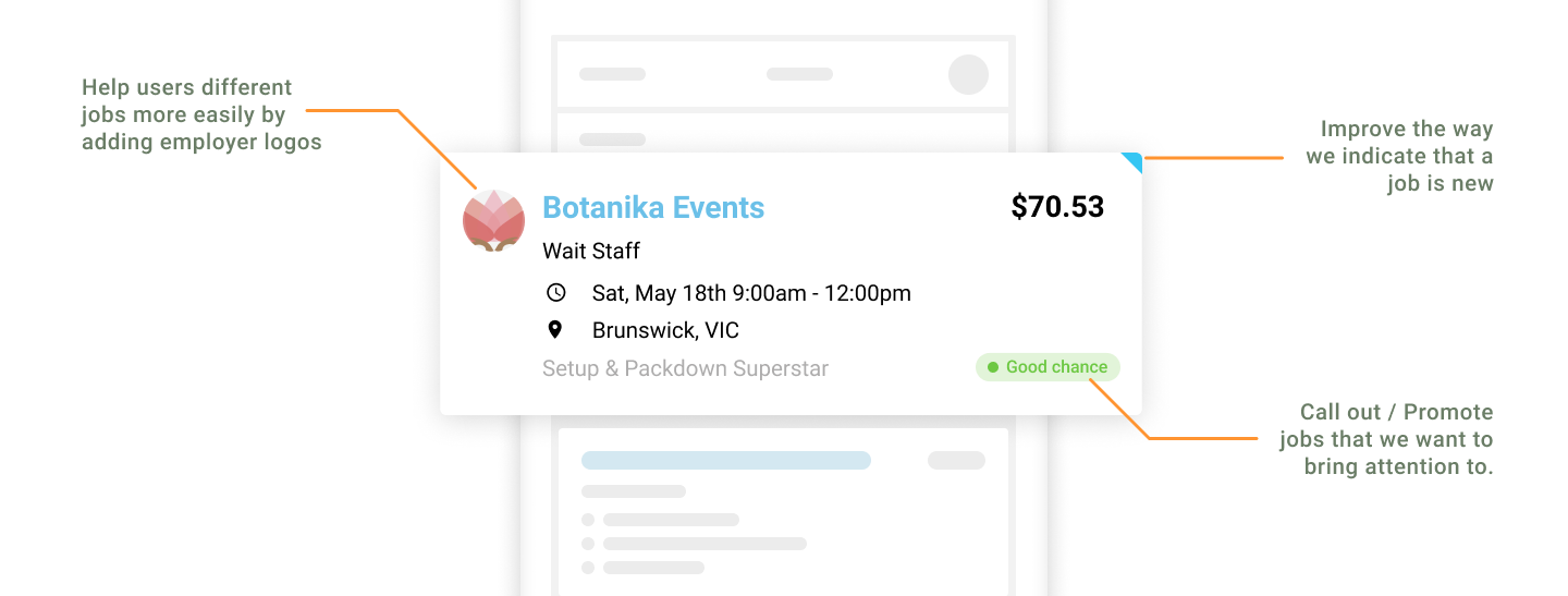
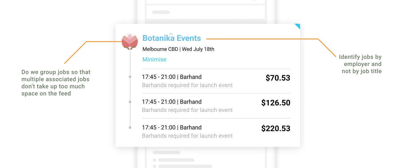
- Employer logos were not useful to the workers, they were interested in what the job was and whether they could perform it not so much who they were working for
- We weren’t convinced that a ‘Good chance’ tag was useful to highlighting a job to users
- We had to figure out how we would sort the jobs depending on how we were going to group them
Speed Testing
Now that we had a good baseline of the issues at hand and what people were looking for in a solution. We did some speedy user testing.
To make our iteration faster, when workers came into our office for onboardings, I would sit them down for quick user tests on a prototype. These sessions would last 10-15 minutes, getting first impressions and thoughts on how they would use it. I would then make quick changes to the solution and be back at it again in time for the next onboarding session.
Here is how the solution evolved as we iterated and tested:
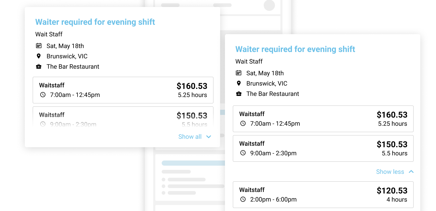
User Test #1
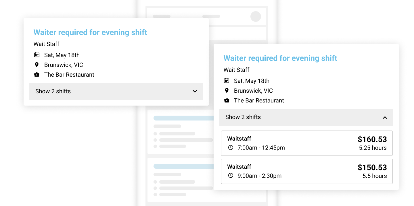
3 x Participants, 2 x Options
Positive feedback:
- They liked being able to see more shifts at a glance
- They generally liked the information provided
- The more you know about a job without having to click through to the details, the better
Areas to improve:
- Better communicate the idea of multiple shifts vs multiple jobs
- It was not clear where they were meant to click to expand the cards
User Test #2
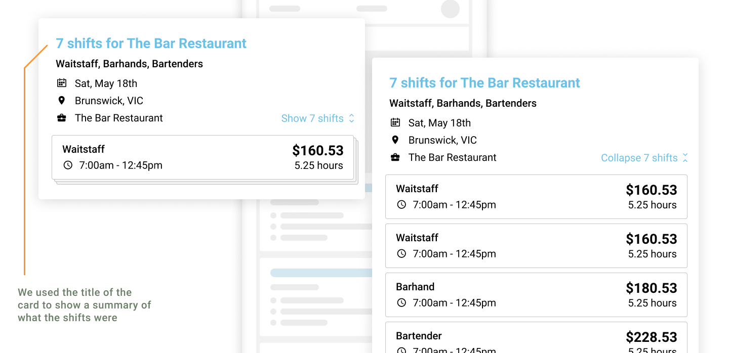
4 x Participants + Internal Feedback
Positive feedback:
- Able to find jobs on a specific date easily
- Feels easy and visually clean
Areas to improve:
- Explore bulk actions like a multi-select or checkbox?
- We could differentiate the roles better
- Better communicate the idea of multiple shifts vs multiple jobs
User Test #3
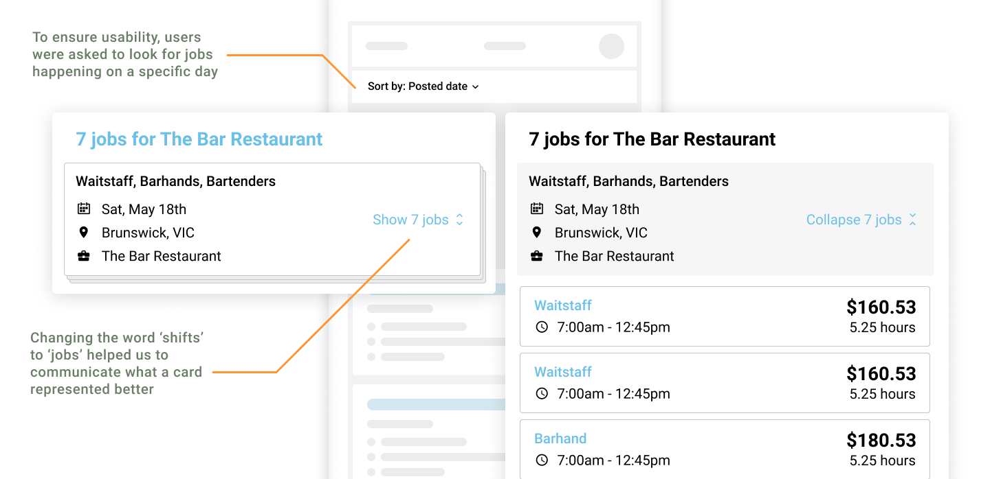
4 x Participants
Testing results:
- They knew what they were doing - users understood that the cards represented jobs and felt that they were giving them all the necessary information
- They performed a given task - people were asked to filter the jobs by date and they were able to do so easily
- Interface was intuitive - no one was confused about where they should click
- No one was confused about the idea of multiple shifts vs multiple jobs - they started to refer to the jobs as individual jobs and not a collection of shifts that made up a job
Conclusion
Testing fast and often helped us to rapidly develop and evolve the solution. Getting as much feedback as we did allowed us to identify nuances that would help us to effectively create an interface that was easy to understand and use.